FRAGILE!
Our public intervention focuses on the flaws of the building that make the environment more difficult for the students to navigate, but also points out key features of the building that are missing and should be considered vital to any academic space in the 21st century.

P.C. Hoofthuis was built by Dutch architect Theo Bosch; it was finalized in 1983 with the help of Aldo Van Eyck. As it houses an educational area for the students at the UVA, it is important to point out its issues and how they might affect students. Our public intervention focuses on the flaws of the building that make the environment more difficult for the students to navigate, but also points out key features of the building that are missing and should be considered vital to any academic space in the 21st century.


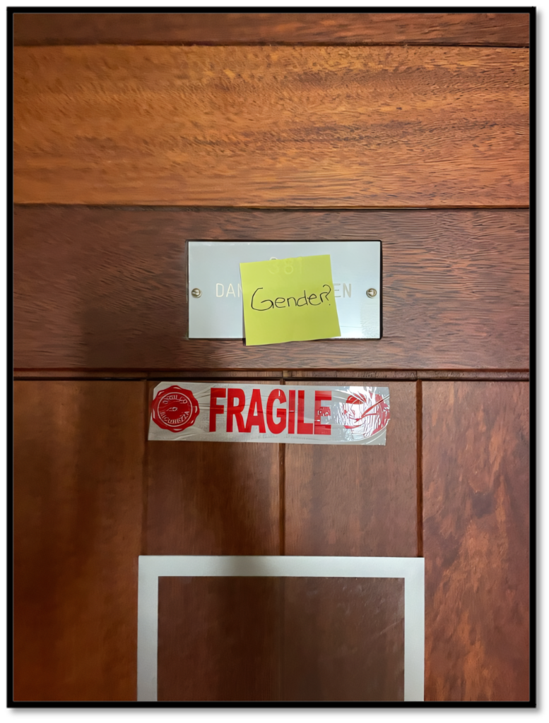
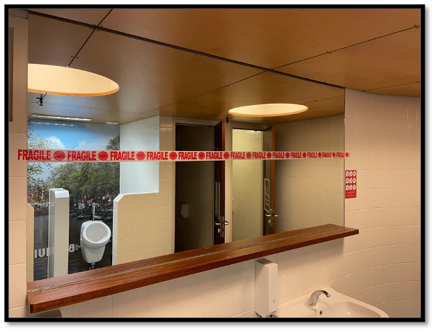
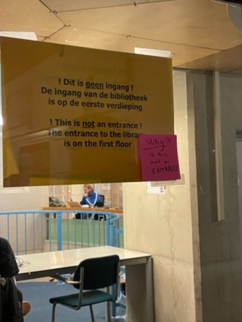
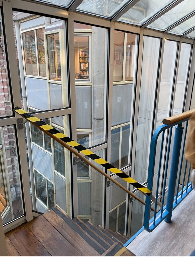
In terms of architecture, the building perfectly represents the ideas that are central in postmodernist architecture. Postmodernist architecture is focused on a design that promotes individualism and experimentation, while defying more common and traditional styles. P.C. Hoofthuis accomplishes this through its controversial division of rooms. These are built to seem open, only being separated by glass, so that they are easy to look into. The approach might seem intentional, but that is not the case. Initially, plans included open classrooms with no walls so that any student could join any seminar or lecture. This was abandoned, so the glass partitions were introduced to reflect that idea. This leaves the building with a confused design that makes the environment feel crowded and disoriented. The idea of openness is further contradicted by the several closed off areas. A good example would be the library that has multiple entrances out of which only one is functional. In order to criticize this, our team closed off staircases and added arrows that lead to unusable entrances to the library. This reflects the confusing signs around the building which are hard to follow for students who do not know the area. Furthermore, this was also done to raise questions on notions of authority. Another important issue we wanted to address is the lack of gender neutral bathrooms. The UVA promotes itself as a space that “wants to be a university where everyone feels at home and feels respected” (Quote from the official UVA Diversity and Inclusion page). This respect is obviously lacking when it comes to non-binary students and professors. The bathrooms on each floor are divided into “men’s” and “women’s”. In order to combat this, our team put up ‘fragile’ tape on bathroom doors and inside bathrooms, as well as covering up signs that promote said gender binary. This is meant to criticize the fragility of this division and the lack of empathy for non-binary individuals.