In Defence of Amsterdam’s Ugliest Buildings teases out that ‘culture’ is contained not only in museums and on pre-war European streets, but everywhere in life, if one chooses to look.
In our last seminar of ‘Introduction to Literary and Cultural Analysis’ the students were encouraged to conduct their own experiments, inspired by the topics and theories we discussed during this course. When researching the subject and issues that we could shine a light on, we came across a photo essay by René Boer, called ‘On The Resilience of Ugliness’. In this essay Boer examines the small-scale urban renewal projects that were built during the 1970s and 1980s. These projects, at the time, created neighborhoods and increased social housing by 85% at their peak. However, they now seem to have gotten the short end of the stick. Since the main focus during the making of these buildings was cost reduction, the houses usually had a functional, minimalist design with postmodern elements. Fast-forward a couple of decades later, the project’s buildings now stood alongside the 17th and 18th century architecture, and were deemed ‘modern eyesores,’ being frequently described as ‘Amsterdam’s ugliest architecture’. Due to these buildings not being as pleasing to the eye as the usual canal houses, they are also insusceptible to one of the main problems taking Amsterdam by storm at the moment: gentrification.
Together as a group we wondered why it is that people have such an adverse reaction to these buildings, and why they’re not considered Amsterdam-like, even if they were designed by Dutch architects with ‘Amsterdam values’ in mind. This is what we wanted to find out by conducting our experiment.
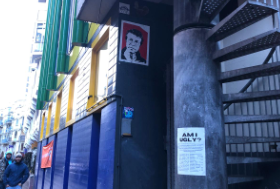
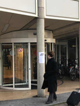
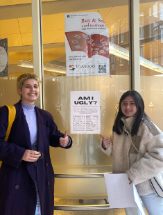
After some brainstorming, we came up with the idea to draw attention to these buildings and to show them some love. We wanted the people that were passing by, be it locals or tourists alike, to actually consider how they might feel about these buildings and to hopefully shed light on their cultural significance in the city. We thought this would be done best through putting up posters and by starting conversations with the people that were interacting with the posters. Soon after we decided on posters as the method of spreading our message, we realized that they’d have to be both eye-catching (yet informative) and straight to the point. This is when we came up with the slogan ‘Am I Ugly?’, a phrase that initially may confuse and gain the interest of most people who stumble upon our posters.
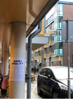
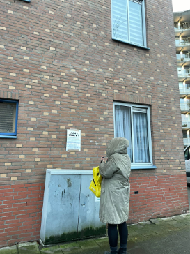
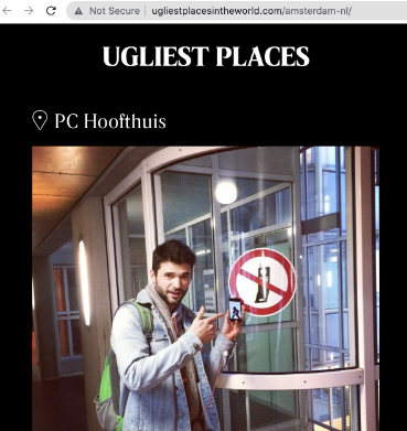
After we settled on the look and the contents of our poster all that was left to do was to put our idea into practice. We decided to split up our team to cover more ground and several neighborhoods. In our group some people chose to visit some other works designed by Aldo Van Eyck, the socialist that designed PC Hoofthuis, like the Hubertus House in the Plantage neighborhood, while others chose buildings they had spotted while exploring the city.
Part of our group actually got the chance to speak to some of the people that passed by and read our posters. They were able to get the people’s reactions and opinions on the subject. Dee for instance, ran into a group of tourists that after quickly glancing at the poster, profusely started telling them they’re not ugly. Dee later explained the concept of our project to them, who were very eager to listen and even took a picture of the poster, telling them they would go check out some of the locations. Kyra, who had decided to put up one of the posters near the Frederik Hendrik neighborhood, bumped into one of the residents who lived inside of the building, who was baffled that anyone would like the building, since even she herself wasn’t a fan of it. After reading our poster she seemed enthusiastic though, and we hope we were able to shift her perspective of her own home.
One thing that was quite disappointing was the fact that the posters we had hung up on PC Hoofthuis, were ripped down after not even a day.
The theoretical axes that we organized our public intervention around consist of a set of concepts.
Gentrification. There is evidently an intermingling between what is considered ‘cultural’ and financially valuable – gentrified neighborhoods are often sold on being ‘colorful’, ‘diverse’ and ‘textured’. Parallel to Edward Soja’s criticisms on postmodern urbanization, the historically cultural areas of Amsterdam (‘metropolarities’) where upper-class tenants and businesses are situated, are visibly the main areas that drive the housing costs up.. In contrast, the supposedly out of place and unpleasant appearance of the buildings we discuss has made them partially immune to this influence, and many of them keep serving as reliable social housing. These houses are relatively newly built and many are well-situated in the city center, which makes them perfect targets for gentrification. Despite the fact, that their numbers are declining with each passing year, the ones that remain grant housing to the middle- and lower-class people thanks to their ‘ugliness’.
Hyperreality. Amsterdam, being a tourist location, relies heavily on branding and a big part of it is the architecture. This branding is so persistent and omnipresent that even many Dutch people and Amsterdammers are only able to conjure up canal-lined streets with slim 18th century houses stacked next to each other when they are asked to imagine Amsterdam. The buildings we discuss disrupt this hyperreal image and raise questions about that well-established image of the city. It is curious to see people resisting the idea that buildings designed by Dutch architects that house Amsterdammers are a part of Amsterdam. It signals desire for aesthetic cohesion, and yet few people raise these concerns over glass-and-steel-facade hotels and shopping malls. This leads to the conclusion that it is not only the aesthetic appearance of the 1970s buildings, but their socioeconomic implications – Amsterdam’s sore housing crisis, the existence of marginalized groups (among the buildings we chose are social houses, an orphanage, and a haven for struggling young mothers) – and this is what unsettles the comforting hyperreal city image. Similar concerns were raised when our posters got taken down from PC Hoofthuis, presumably to keep the outside appearance of the building clean, despite their completely inoffensive appearance and content. Ironically this is happening all the while the inside of the building is in dire need of maintenance. Thus, we concluded that there is a dire need to realize the pervasive hyperreal image of tidy, clean buildings (even if the majority considers them ugly no matter what) and its effects.
Different definitions of culture. For us, the hyperreal image of Amsterdam architecture that excludes the 1970s projects is rooted in Matthew Arnold’s definition of culture as ‘the best that has been thought and said in the world’. Notably, this is a very European Enlightenment notion, exalting specifically European culture, hence why the decorated, 18th century rich merchant houses, monarchy-sponsored museums and concert halls are what is considered ‘Amsterdam culture’ today. These buildings accentuate prosperity, enlightenment and celebration, while the 1970s architecture created out of necessity to house the marginalized and architected by jaded socialists brings to mind poverty, practicality and capitulation of style for substance. This is, however, a very pessimistic view of interpreting these ‘ugly’ buildings, and in order to show them some love we argue that they instead fit Raymond Williams’ definition of culture as ‘ordinary’. They call to attention that despite their uncluttered facades, they were the product of architectural creativity and even ideological struggle (Aldo van Eyck and Theo Bosch’s disagreements on whether a socialist or an anarchist vision should guide in designing PC Hoofthuis) and contain such cultural melting pots as a university campus. It teases out that ‘culture’ is contained not only in museums and on pre-war European streets, but everywhere in life, if one chooses to look.